Difference between revisions of "Start with Smart Docking library"
(→Docking Control) |
(→Docking Control) |
||
| Line 76: | Line 76: | ||
*Apply Changes: Apply docking operations to target selected content. | *Apply Changes: Apply docking operations to target selected content. | ||
| + | *Type Editor: Set content's type to editor type. | ||
| + | *Type Tool: Set content's type to tool type. | ||
| + | *Type Place Holder: Set content's type to place holder type. | ||
| + | *Position Top: Set content's dock at top level of main window. You can select one of four directions from right side Directions options. | ||
| + | *Position Tab With: Set content's tab with another content. You can select another content from right side Existing Contents, and use the Direction options to decide tab at left or right side. | ||
| + | *Position Relative: Set content's dock at one side of another content. You can select another content from right side Existing Contents, and use the Direction options to decide dock at one side of top/bottom/left/right. | ||
| + | *Position Auto Hide: Set content's auto hide which will showing a tab stub at one side of main window. You can select the direction at the right side Direction options. | ||
| + | *Position Float: Undock current selected content. You can specify floating position from right side Screen Position. | ||
| + | *Default Editor: If current selected content is editor type content, you can set the content to default editor position which is holding by the place holder content. | ||
Revision as of 23:51, 19 August 2007
If this is the first time you try to play with Smart Docking library. It's recommend you to compile the examples in $EIFFEL_SRC/example/docking folder. In the folder, there are two examples:
Simple
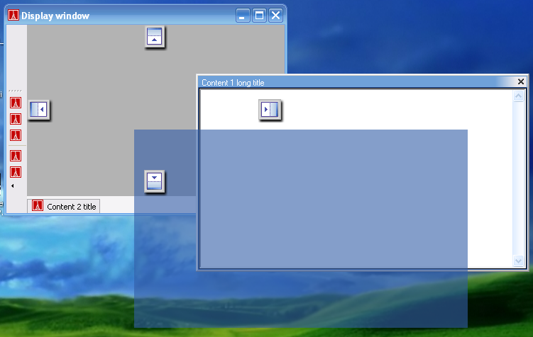
Snapshot:
What you will found:
The basic features of Smart Docking library.
- You can try to drag the zones with name `Content 1' and `Content 2', move them around and undock them.
- See the nice dragging feedbacks.
- Try to dock `Content 1' at the sides of `Content 2', or try to tab `Content 1' with `Content 2'.
You can also play with the tool bar:
- Undock the tool bar.
- Dock the tool bar at top/bottom/left/right side of main window.
- Resize the floating tool bar to several rows.
`Ctrl + Tab' is supported, too.
Docking Control
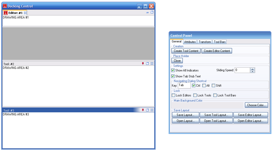
Snapshot:
What you will found:
You can try almost all the features of Smart Docking library just by press the buttons on the control panel.
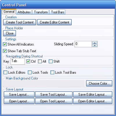
General tab's buttons and options:
- Create Tool Content: Create a zone which type is tool.
- Create Editor Content: Create a zone which type is editor.
- Place Holder close: Close the place holder zone which is the grey area in the main window.
- Show All Indicators: When dragging a zone, should Smart Docking library show all indicators same time when use transparent rectangle style feedback?
- Sliding Speed: Control the speed of auto hide tab stub sliding animation.0 means no animation.
- Show Tab Stub Text. Should auto hide tab stubs of a group always showing all the texts even some of them not active.
- Navigation Dialog Shortcut: Set the accelerator of zone navigation dialog.
- Lock Editors: Enable/Disable docking mechanism of all editor type zones.
- Lock Tools: Enable/Disable docking mechanism of all tool type zones.
- Lock Tool Bars: Enable/Disable docking mechanism of all tool bars.
- Main Background Color: Set the background color of main window when no zone docking.
- Save Layout: Save current whole docking layout to a file.
- Save Tool Layout: Save current tool type zones layout to a file.
- Save Editor Layout: Save current editor type zones layout to a file.
- Open Layout: Restore all zones docking layout from a file.
- Open Tool Layout: Open tool type zones docking layout from a file.
- Open Editor Layout: Open editor type zones docking layout from a file.
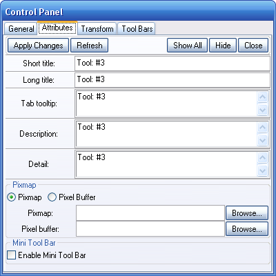
Attribute tab's buttons and options:
- Apply Changes: Set current values to target Smart Docking content.
- Refresh: If selected content's attribute changed, press this button to update the values showing in the control panel.
- Show All: Make all the contents visible.
- Hide: Hide current selected content.
- Close: Close current selected content. After close, the content is removed from Smart Docking library. It can't be visible again by pressing `Show All' button.
- Short title: The title which is shown on auto hide tab stub and notebook tab.
- Long title: The title which is shown on the top side title bar of a content.
- Tab tooltip: The tooltip text of content notebook book tab.
- Description: When show zone navigation dialog (default invoked by `Ctrl + Tab'), we use this description texts.
- Detail: When show zone navigation dialog, we use this detail texts.
- Pixmap: The icon showing on content notebook tab and auto hide tab if Gdi+ not available on Windows platform.
- Pixel Buffer: The icon showing on content notebook tab and auto hide tab if Gdi+ available on Windows platform.
- Enable Mini Tool Bar: Add/remove mini tool bar to target content. The mini tool bar is showing at the right side of content's title bar.
Transform tab's buttons and options:
- Apply Changes: Apply docking operations to target selected content.
- Type Editor: Set content's type to editor type.
- Type Tool: Set content's type to tool type.
- Type Place Holder: Set content's type to place holder type.
- Position Top: Set content's dock at top level of main window. You can select one of four directions from right side Directions options.
- Position Tab With: Set content's tab with another content. You can select another content from right side Existing Contents, and use the Direction options to decide tab at left or right side.
- Position Relative: Set content's dock at one side of another content. You can select another content from right side Existing Contents, and use the Direction options to decide dock at one side of top/bottom/left/right.
- Position Auto Hide: Set content's auto hide which will showing a tab stub at one side of main window. You can select the direction at the right side Direction options.
- Position Float: Undock current selected content. You can specify floating position from right side Screen Position.
- Default Editor: If current selected content is editor type content, you can set the content to default editor position which is holding by the place holder content.


