Difference between revisions of "What the Smart Docking library looks like"
m (→The tool bar is also dockable) |
m (What is Smart Docking library looks like moved to What the Smart Docking library looks like: The title was misspelled) |
||
| (11 intermediate revisions by 2 users not shown) | |||
| Line 5: | Line 5: | ||
[[Image:Smart_Docking_multi_level_docking.PNG]] | [[Image:Smart_Docking_multi_level_docking.PNG]] | ||
| − | + | '''Figure 1:''' The innermost, red rectangle has one Zone called "Content 1" which is docked to the left side of Zone "Content 2". The green rectangle contains the "Content 1" and "Content 2" Zones. It is itself docked to the top side of Zone "Content 3". Combining those 3 zones together, we get the blue rectangle, and this blue rectangle is docking at the left side of "Content 4" zone and so forth. As you guess, this kind of recursive docking zones can dock endlessly. | |
| − | + | A ''Zone'' is an special widget, managed by the Smart Docking library and contains the widgets of the client programmer. Normally it has a title at the top which is generated by the Smart Docking library automatically. | |
== Auto hide zones with vertical title tabs when docking left/right == | == Auto hide zones with vertical title tabs when docking left/right == | ||
| Line 13: | Line 13: | ||
[[Image:What_is_Smart_Docking_library_looks_like_auto_hide_zone.png]] | [[Image:What_is_Smart_Docking_library_looks_like_auto_hide_zone.png]] | ||
| − | + | '''Figure 2:''' This picture shows two auto hide tabs, at the top and on the left side, each belonging to - and displaying the name - of a Zone. (Right or bottom positions can also be specified). If the user hovers his pointer over the "Content 1" tab for a short time (or click on the "Content 1" tab), the "Content 1" zone will appear as can be seen on the right side of the image. When showing the "Content 1", there is a window sliding animation effect. Client programmers can cancel this effect after configure Smart Docking library. If end user's pointer leave the red rectangle area of right side image and the "Content 1" tab stub area for a moment. "Content 1" zone will disappear automatically. It will return to the state showing in the left side of image. So we call this feature "Auto Hide". | |
| − | When tab stubs stay at left/right side of main window, the titles of the hidden zone | + | When tab stubs stay at left/right side of main window, the titles of the hidden zone are displayed vertically. |
| − | == | + | == Content types == |
| − | + | A Zone's content can be set of 'editor' or 'tool' type via the set_type feature of SD_CONTENT. | |
| + | The two types have a different look (see Figure 3) and different behavior when being dragged (See next topic). | ||
[[Image:What_is_Smart_Docking_library_looks_like_figure_1.png]] | [[Image:What_is_Smart_Docking_library_looks_like_figure_1.png]] | ||
| − | |||
| − | |||
== Only one editor's docking area. == | == Only one editor's docking area. == | ||
| Line 43: | Line 42: | ||
* Audo hide tool bar buttons when not enough space. | * Audo hide tool bar buttons when not enough space. | ||
| − | + | [[Image:What_is_Smart_Docking_library_looks_like_auto_hide_tool_bar_button.png]] | |
| + | |||
| + | See figure 7. The top side shows a window which has enough width for all tool bar buttons in current row. We resize the main window to a smaller size. In the middle image, two tool bar buttons are hidden, because there is not enough space to show. The hidden buttons are "Bar 2 (3)" and "Bar 3 (4)". At this time, if end user presses the button at the end of tool bar, a dialog with the hidden tool bar buttons will appear. | ||
| + | |||
| + | |||
| + | * Resize tool bar zone manually. | ||
| + | |||
| + | [[Image:What_is_Smart_Docking_library_looks_like_resize_tool_bar_width_manually.png]] | ||
| + | |||
| + | See figure 8. There is not enough space for all tool bar buttons, end user can drag the head of a tool bar (the yellow circle) to change the width of tool bars. In top window, left tool bar buttons "Bar 1 (3)" and "Bar 1 (4)" is visible, and right tool bar has invisible tool bar buttons. After end user dragging, the left tool bar width changed to a smaller size and right tool bar width changed to a larger size. So at the bottom window, left tool bar button “Bar 1 (3)” and “Bar 1 (4)” is invisible, right tool bar have enough space to show all the tool bar buttons. | ||
* Tool bar can float. | * Tool bar can float. | ||
| − | + | ||
| + | [[Image:What_is_Smart_Docking_library_looks_like_tool_bar_floating.png]] | ||
| + | |||
| + | See figure 9. If end user drag the head a tool bar to a place except the four borders areas of main window (or end user can press Ctrl key when dragging the tool bar at borders areas), the tool bar will floating. | ||
| + | |||
* When tool bar floating, user can drag border of tool bar and resize tool bar buttons to different rows. | * When tool bar floating, user can drag border of tool bar and resize tool bar buttons to different rows. | ||
| + | |||
| + | [[Image:What_is_Smart_Docking_library_looks_like_resize_floating_tool_bar.png]] | ||
| + | |||
| + | See figure 10. End user can drag any side of floating tool bar to resize the tool bar. When the size of floating tool bars changing, Smart Docking library will automatically rearrange the tool bar buttons positions. | ||
* Customize supported. | * Customize supported. | ||
| + | |||
| + | [[Image:What_is_Smart_Docking_library_looks_like_tool_bar_customize.png]] | ||
| + | |||
| + | After end user press the last button at a docking tool bar, or after end user press the drop down button at floating tool bar title bar, a pop up window with customize button will show. Press customize button, "Customize Toolbar" dialog will appear. End user can change tool bar button visibility and order in the dialog. | ||
* Double click on the header of a docking tool bar, it'll float to last floating position and last floating size. Or double click title bar of floating tool bar zone, it'll dock to last docked row and position. | * Double click on the header of a docking tool bar, it'll float to last floating position and last floating size. Or double click title bar of floating tool bar zone, it'll dock to last docked row and position. | ||
| + | |||
| + | * Tool bar can also dock at left and right side of main window. | ||
== Docking feedbacks == | == Docking feedbacks == | ||
* There are two kinds of docking feedback currently available: | * There are two kinds of docking feedback currently available: | ||
| − | + | [[Image:What_is_Smart_Docking_library_looks_like_two_docking_feedback_styles.png]] | |
| − | + | ||
| − | + | In figure 12 top part is the style used in Windows which have per-pixel alpha blend indicators and a transparent dragging window feedback rectangle. | |
| − | + | In figure 12 bottom part, is the other one used in UNIX like system or Windows when using remote desktop (terminal service). It have a half-tone rectangle to represent dragging window area. The style uses a solid border rectangle on UNIX. The pointer cursor and feedback rectangle will change base on current pointer position. | |
* Client programmer can make there own docking feedbacks if they wish. | * Client programmer can make there own docking feedbacks if they wish. | ||
| Line 67: | Line 88: | ||
== Ctrl + Tab navigation == | == Ctrl + Tab navigation == | ||
| − | + | [[Image:What_is_Smart_Docking_library_looks_like_ctrl_tab.png]] | |
| + | |||
| + | After end user pressed "Ctrl + Tab" key, a zone navigation dialog will appear. As you seen in figure 13, the zones are separate to two categories automatically. End users can see description and detail information in the dialog. After end user released "Ctrl" key, the dialog will disappear and the zone represented by selected item in the dialog will be selected and will has focus. | ||
Latest revision as of 23:35, 15 June 2009
Contents
Multiple levels of docking and nesting
Figure 1: The innermost, red rectangle has one Zone called "Content 1" which is docked to the left side of Zone "Content 2". The green rectangle contains the "Content 1" and "Content 2" Zones. It is itself docked to the top side of Zone "Content 3". Combining those 3 zones together, we get the blue rectangle, and this blue rectangle is docking at the left side of "Content 4" zone and so forth. As you guess, this kind of recursive docking zones can dock endlessly.
A Zone is an special widget, managed by the Smart Docking library and contains the widgets of the client programmer. Normally it has a title at the top which is generated by the Smart Docking library automatically.
Auto hide zones with vertical title tabs when docking left/right
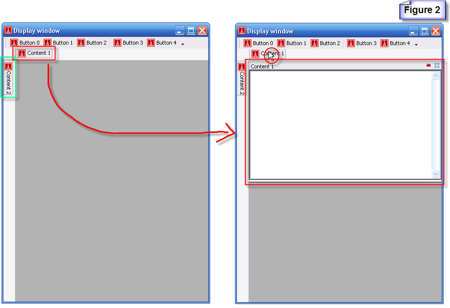
Figure 2: This picture shows two auto hide tabs, at the top and on the left side, each belonging to - and displaying the name - of a Zone. (Right or bottom positions can also be specified). If the user hovers his pointer over the "Content 1" tab for a short time (or click on the "Content 1" tab), the "Content 1" zone will appear as can be seen on the right side of the image. When showing the "Content 1", there is a window sliding animation effect. Client programmers can cancel this effect after configure Smart Docking library. If end user's pointer leave the red rectangle area of right side image and the "Content 1" tab stub area for a moment. "Content 1" zone will disappear automatically. It will return to the state showing in the left side of image. So we call this feature "Auto Hide".
When tab stubs stay at left/right side of main window, the titles of the hidden zone are displayed vertically.
Content types
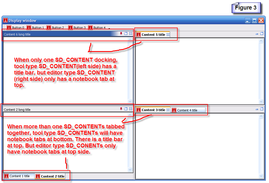
A Zone's content can be set of 'editor' or 'tool' type via the set_type feature of SD_CONTENT. The two types have a different look (see Figure 3) and different behavior when being dragged (See next topic).
Only one editor's docking area.
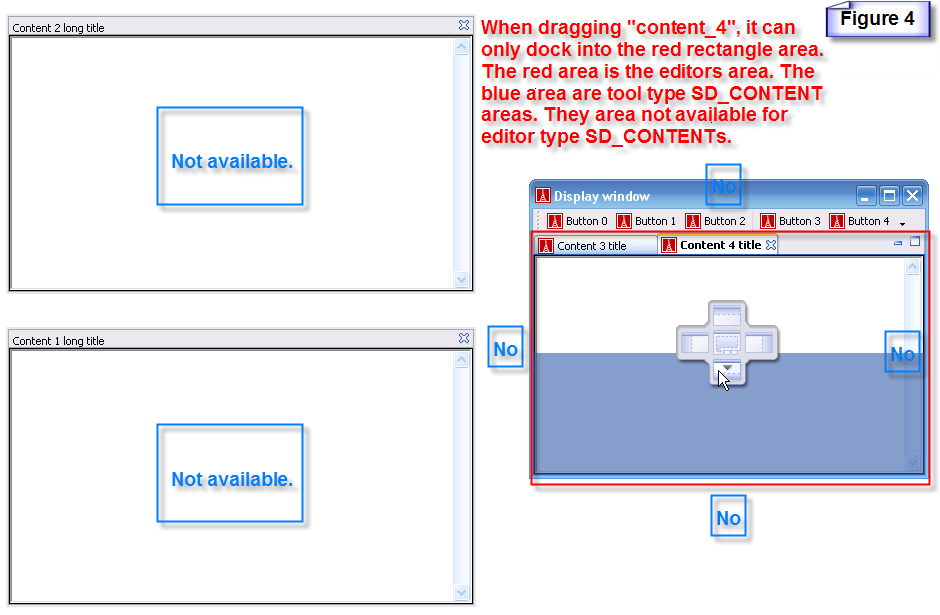
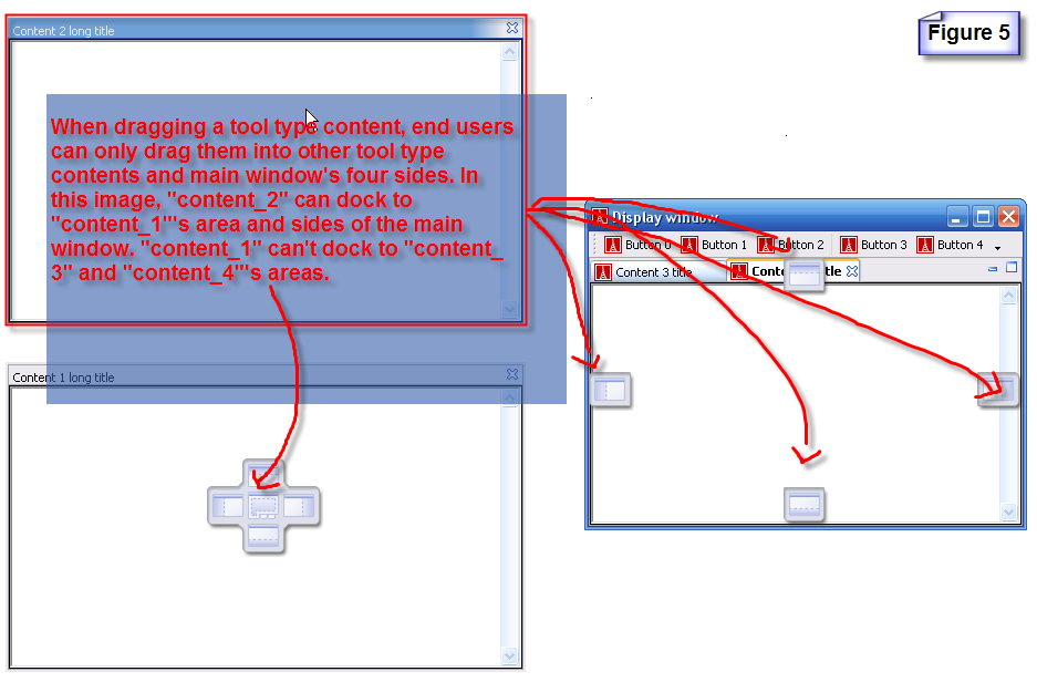
SD_CONTENTs which are not editor type can’t dragged into the editors area. See figure 4. Vice versa. Editor type SD_CONTENTs can't floating. See figure 5.
The tool bar is also dockable
- Multiple tool bars in a single row.
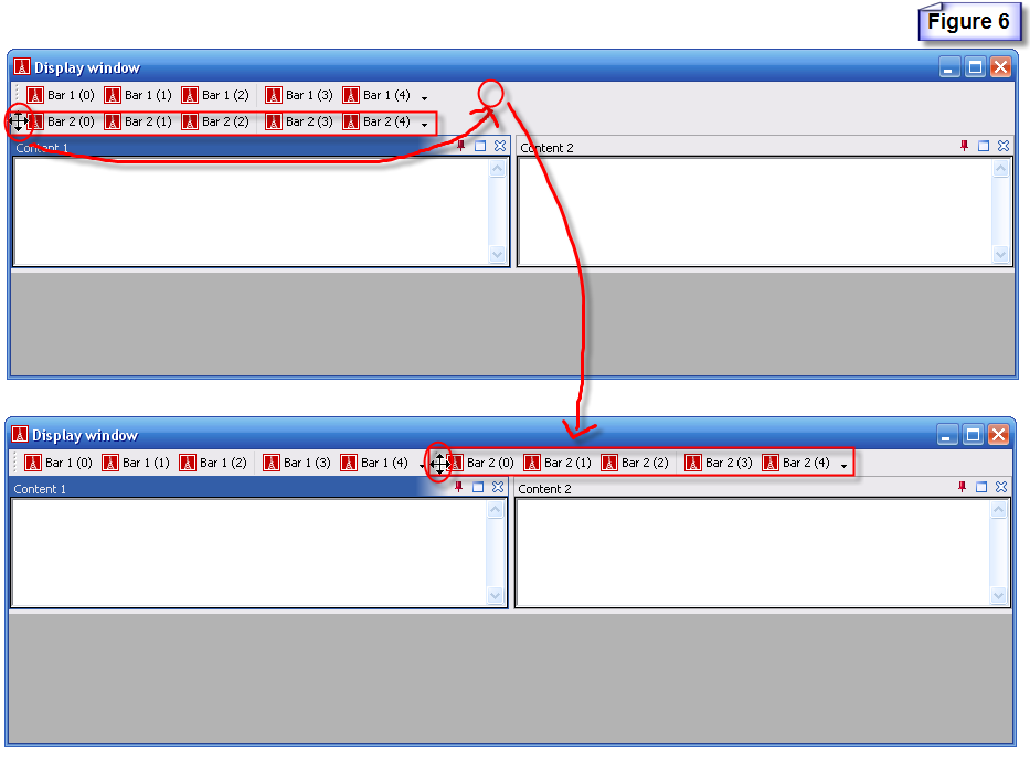
End user can drag the head of a tool bar. See figure 6 top side, end user is dragging the tool bar to the right side of first tool bar. The result is showing in the bottom side of figure 6.
- Audo hide tool bar buttons when not enough space.
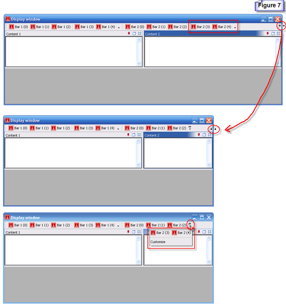
See figure 7. The top side shows a window which has enough width for all tool bar buttons in current row. We resize the main window to a smaller size. In the middle image, two tool bar buttons are hidden, because there is not enough space to show. The hidden buttons are "Bar 2 (3)" and "Bar 3 (4)". At this time, if end user presses the button at the end of tool bar, a dialog with the hidden tool bar buttons will appear.
- Resize tool bar zone manually.
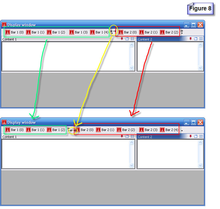
See figure 8. There is not enough space for all tool bar buttons, end user can drag the head of a tool bar (the yellow circle) to change the width of tool bars. In top window, left tool bar buttons "Bar 1 (3)" and "Bar 1 (4)" is visible, and right tool bar has invisible tool bar buttons. After end user dragging, the left tool bar width changed to a smaller size and right tool bar width changed to a larger size. So at the bottom window, left tool bar button “Bar 1 (3)” and “Bar 1 (4)” is invisible, right tool bar have enough space to show all the tool bar buttons.
- Tool bar can float.
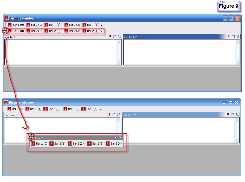
See figure 9. If end user drag the head a tool bar to a place except the four borders areas of main window (or end user can press Ctrl key when dragging the tool bar at borders areas), the tool bar will floating.
- When tool bar floating, user can drag border of tool bar and resize tool bar buttons to different rows.
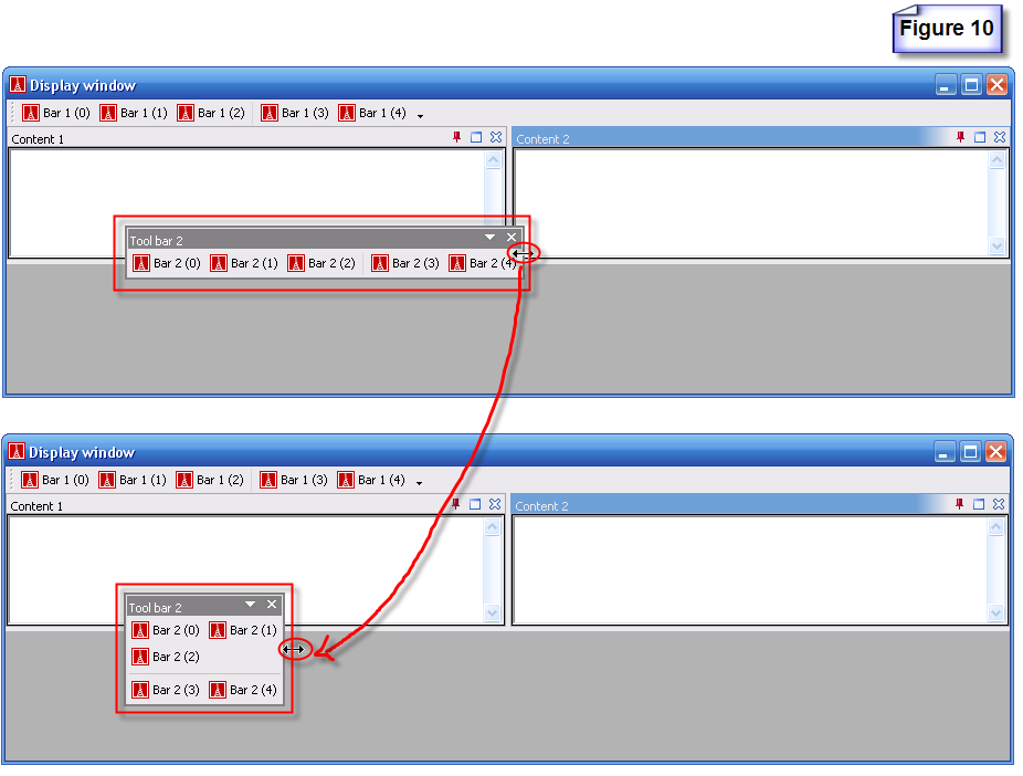
See figure 10. End user can drag any side of floating tool bar to resize the tool bar. When the size of floating tool bars changing, Smart Docking library will automatically rearrange the tool bar buttons positions.
- Customize supported.
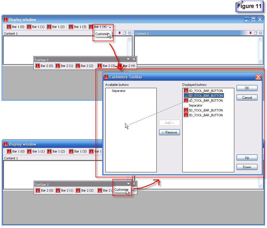
After end user press the last button at a docking tool bar, or after end user press the drop down button at floating tool bar title bar, a pop up window with customize button will show. Press customize button, "Customize Toolbar" dialog will appear. End user can change tool bar button visibility and order in the dialog.
- Double click on the header of a docking tool bar, it'll float to last floating position and last floating size. Or double click title bar of floating tool bar zone, it'll dock to last docked row and position.
- Tool bar can also dock at left and right side of main window.
Docking feedbacks
- There are two kinds of docking feedback currently available:
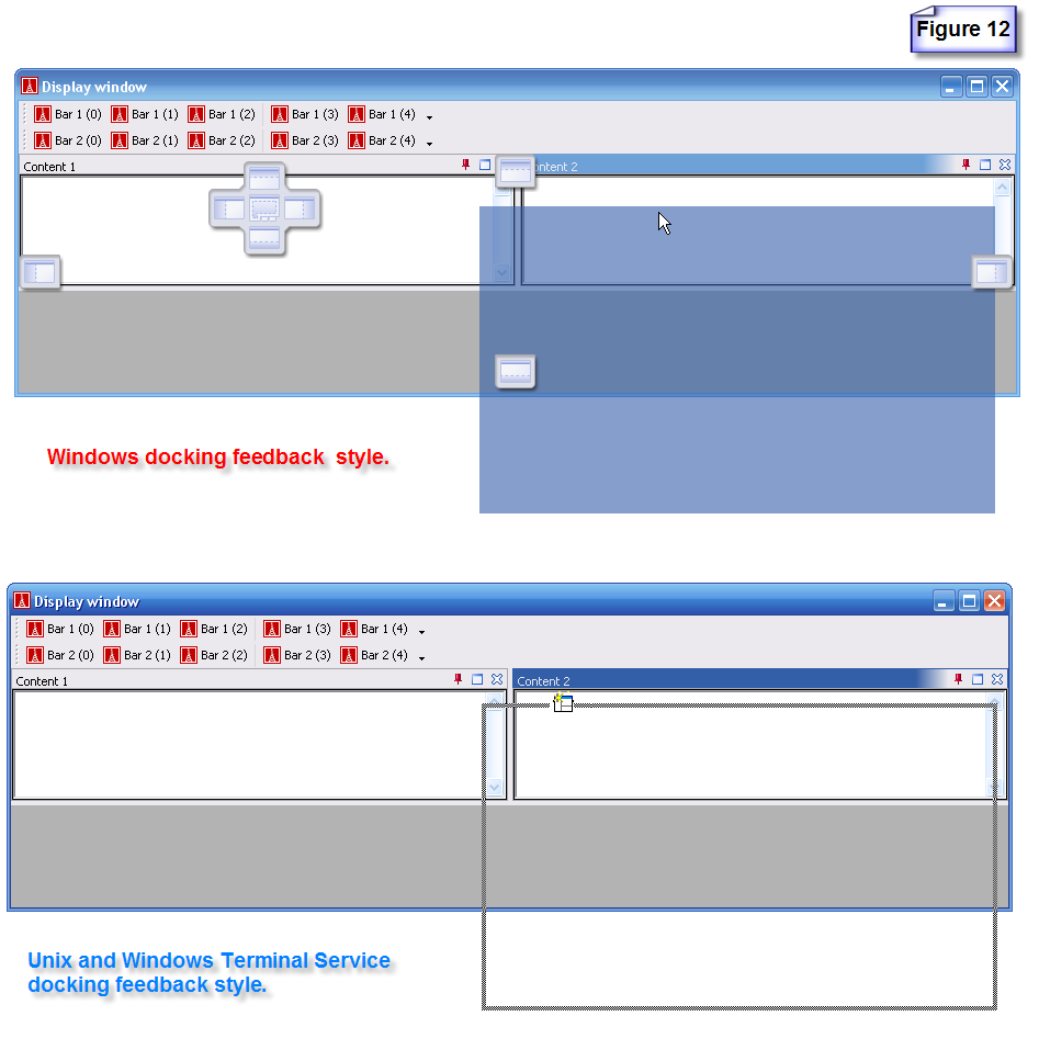
In figure 12 top part is the style used in Windows which have per-pixel alpha blend indicators and a transparent dragging window feedback rectangle. In figure 12 bottom part, is the other one used in UNIX like system or Windows when using remote desktop (terminal service). It have a half-tone rectangle to represent dragging window area. The style uses a solid border rectangle on UNIX. The pointer cursor and feedback rectangle will change base on current pointer position.
- Client programmer can make there own docking feedbacks if they wish.
Client programmers can inherit from SD_HOT_ZONE, implemented a set of docking feedbacks for main window, normal docking window and tabbed docking window. Then implemented a new SD_HOT_ZONE_ABSTRACT_FACTORY.
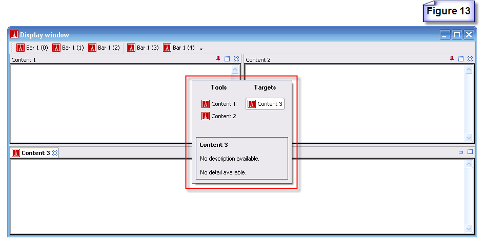
After end user pressed "Ctrl + Tab" key, a zone navigation dialog will appear. As you seen in figure 13, the zones are separate to two categories automatically. End users can see description and detail information in the dialog. After end user released "Ctrl" key, the dialog will disappear and the zone represented by selected item in the dialog will be selected and will has focus.

