Difference between revisions of "Start with Smart Docking library"
m (→Simple) |
m |
||
| (28 intermediate revisions by 2 users not shown) | |||
| Line 1: | Line 1: | ||
| − | If | + | If you just start work with the Smart Docking library. It is recommend that you to compile and play with the examples in $EIFFEL_SRC/example/docking folder. There are two examples: |
== Simple == | == Simple == | ||
Snapshot: | Snapshot: | ||
| + | |||
[[Image:start_with_smart_docking_library_1.png]] | [[Image:start_with_smart_docking_library_1.png]] | ||
| − | What you will | + | What you will find: |
| + | |||
The basic features of Smart Docking library. | The basic features of Smart Docking library. | ||
| + | *You can try to drag the zones with name `Content 1' and `Content 2', move them around and undock them. | ||
| + | *See the nice dragging feedbacks. | ||
| + | *Try to dock `Content 1' at the sides of `Content 2', or try to tab `Content 1' with `Content 2'. | ||
| + | |||
| + | You can also play with the tool bar: | ||
| + | *Undock the tool bar. | ||
| + | *Dock the tool bar at top/bottom/left/right side of main window. | ||
| + | *Resize the floating tool bar to several rows. | ||
| + | |||
| + | `Ctrl + Tab' is supported, too. | ||
== Docking Control == | == Docking Control == | ||
| − | + | Snapshot: | |
| − | start_with_smart_docking_library_2.png | + | |
| + | [[Image:start_with_smart_docking_library_2.png]] | ||
| + | |||
| + | What you will find: | ||
| + | |||
| + | You can try almost all the features of Smart Docking library just by pressing the buttons on the control panel. | ||
| + | |||
| + | |||
| + | ====General==== | ||
| + | |||
| + | [[Image:start_with_smart_docking_library_3.png]] | ||
| + | |||
| + | *Create Tool Content: Create a content which type is tool. | ||
| + | *Create Editor Content: Create a content which type is editor. | ||
| + | *Place Holder close: Close the place holder zone which is the grey area in the main window. | ||
| + | *Show All Indicators: When dragging a zone, should Smart Docking library show all indicators same time when use transparent rectangle style feedback? | ||
| + | *Sliding Speed: Control the speed of auto hide tab stub sliding animation.0 means no animation. | ||
| + | *Show Tab Stub Text: Should auto hide tab stubs of a group always showing all the texts even some of them not active. | ||
| + | *Navigation Dialog Shortcut: Set the accelerator of zone navigation dialog. | ||
| + | *Lock Editors: Enable/Disable docking mechanism of all editor type contents. | ||
| + | *Lock Tools: Enable/Disable docking mechanism of all tool type contents. | ||
| + | *Lock Tool Bars: Enable/Disable docking mechanism of all tool bars contents. | ||
| + | *Main Background Color: Set the background color of main window when no content docking. | ||
| + | *Save Layout: Save current whole docking layout to a file. | ||
| + | *Save Tool Layout: Save current tool type contents layout to a file. | ||
| + | *Save Editor Layout: Save current editor type contents layout to a file. | ||
| + | *Open Layout: Restore all contents docking layout from a file. | ||
| + | *Open Tool Layout: Open tool type contents docking layout from a file. | ||
| + | *Open Editor Layout: Open editor type contents docking layout from a file. | ||
| + | |||
| + | |||
| + | ====Attribute==== | ||
| + | |||
| + | [[Image:start_with_smart_docking_library_4.png]] | ||
| + | |||
| + | *Apply Changes: Set current values to target selected content. | ||
| + | *Refresh: If selected content's attribute changed, press this button to update the values showing in the control panel. | ||
| + | *Show All: Make all the contents visible. | ||
| + | *Hide: Hide current selected content. | ||
| + | *Close: Close current selected content. After close, the content is removed from Smart Docking library. It can't be visible again by pressing `Show All' button. | ||
| + | *Short title: The title which is showing on auto hide tab stub and notebook tab. | ||
| + | *Long title: The title which is showing on the top side title bar of a content. | ||
| + | *Tab tooltip: The tooltip text of content notebook book tab. | ||
| + | *Description: When showing zone navigation dialog (default invoked by `Ctrl + Tab'), we use this description texts for the content. | ||
| + | *Detail: When showing zone navigation dialog, we use this detail texts for the content. | ||
| + | *Pixmap: The icon showing on content notebook tab and auto hide tab if Gdi+ not available on Windows platform. | ||
| + | *Pixel Buffer: The icon showing on content notebook tab and auto hide tab if Gdi+ available on Windows platform. | ||
| + | *Enable Mini Tool Bar: Add/remove mini tool bar to target content. The mini tool bar is showing at the right side of content's title bar. | ||
| + | |||
| + | |||
| + | ====Transform==== | ||
| + | |||
| + | [[Image:start_with_smart_docking_library_5.png]] | ||
| + | |||
| + | *Apply Changes: Apply docking operations to target selected content. | ||
| + | *Type Editor: Set content's type to editor type. | ||
| + | *Type Tool: Set content's type to tool type. | ||
| + | *Type Place Holder: Set content's type to place holder type. | ||
| + | *Position Top: Set content's dock at top level of main window. You can select one of four directions from right side `Directions' options. | ||
| + | *Position Tab With: Set content's tab with another content. You can select another content from right side `Existing Contents', and use the `Direction' options to decide tab at left or right side. | ||
| + | *Position Relative: Set content's dock at one side of another content. You can select another content from right side `Existing Contents', and use the `Direction' options to decide dock at one side of top/bottom/left/right. | ||
| + | *Position Auto Hide: Set content's auto hide which will showing a tab stub at one side of main window. You can select the direction at the right side `Direction' options. | ||
| + | *Position Float: Undock current selected content. You can specify floating position from right side `Screen Position'. | ||
| + | *Default Editor: If current selected content is editor type content, you can set the content to default editor position which is holding by the place holder content. | ||
| + | |||
| + | |||
| + | ====Tool Bar==== | ||
| + | |||
| + | [[Image:start_with_smart_docking_library_6.png]] | ||
| − | + | *Existing ToolBars: Show all existing tool bar in this project. By default, no tool bar available. | |
| − | You can | + | *Create Tool Bar: Create a Smart Docking library tool bar and add it at the top side of main window. |
| + | *Add Button: Add a tool bar button to selected tool bar in the `Existing ToolBars' list. You should press `Set Top' button to update the target tool bar. | ||
| + | *Add Build-in Widget: Add any Vision2 widgets to the selected tool bar. You should press `Set Top' button to update the target tool bar. | ||
| + | *Add Toggle Button: Add a toggle button to the selected tool bar. You should press `Set Top' button to update the target tool bar. | ||
| + | *Add Build-in Resizable: Add a resizable tool bar button to the selected tool bar. A resizable tool bar item can be resized directly by dragging the end of the item. You should press `Set Top' button to update the target tool bar. | ||
| + | *Add Radio Button: Add a radio button to the selected tool bar. The button is kind of toggle button which selected state is mutually exclusive with respect to other tool bar radio buttons in a tool bar. You should press `Set Top' button to update the target tool bar. | ||
| + | *Add Separator: Add a tool bar separator to the selected tool bar. You should press `Set Top' button to update the target tool bar. | ||
| + | *Add Menu Button: Add a menu item to the selected tool bar. You should press `Set Top' button to update the target tool bar. For the moment (2007 Aug), this kind of item is not fully developed. | ||
| + | *Show: Show the selected tool bar. | ||
| + | *Hide: Hide the selected tool bar. | ||
| + | *Close: Close the selected tool bar. The tool bar will be removed from the Smart Docking library. It can't be visible again by press the `Show' button. | ||
| + | *Set title: Set the title of the selected tool bar. | ||
| + | *Set top: Set the selected tool bar docking at top/bottom/left/right side of main window. | ||
Latest revision as of 22:38, 15 June 2009
If you just start work with the Smart Docking library. It is recommend that you to compile and play with the examples in $EIFFEL_SRC/example/docking folder. There are two examples:
Simple
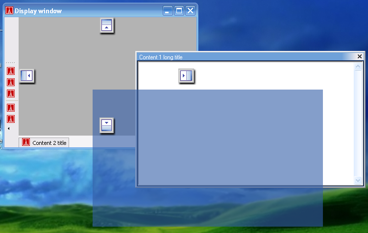
Snapshot:
What you will find:
The basic features of Smart Docking library.
- You can try to drag the zones with name `Content 1' and `Content 2', move them around and undock them.
- See the nice dragging feedbacks.
- Try to dock `Content 1' at the sides of `Content 2', or try to tab `Content 1' with `Content 2'.
You can also play with the tool bar:
- Undock the tool bar.
- Dock the tool bar at top/bottom/left/right side of main window.
- Resize the floating tool bar to several rows.
`Ctrl + Tab' is supported, too.
Docking Control
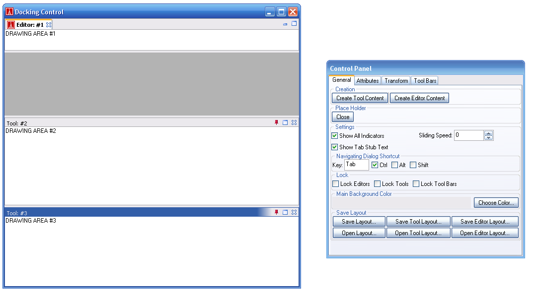
Snapshot:
What you will find:
You can try almost all the features of Smart Docking library just by pressing the buttons on the control panel.
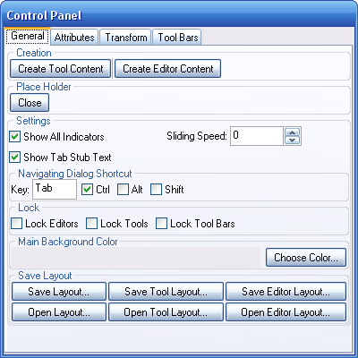
General
- Create Tool Content: Create a content which type is tool.
- Create Editor Content: Create a content which type is editor.
- Place Holder close: Close the place holder zone which is the grey area in the main window.
- Show All Indicators: When dragging a zone, should Smart Docking library show all indicators same time when use transparent rectangle style feedback?
- Sliding Speed: Control the speed of auto hide tab stub sliding animation.0 means no animation.
- Show Tab Stub Text: Should auto hide tab stubs of a group always showing all the texts even some of them not active.
- Navigation Dialog Shortcut: Set the accelerator of zone navigation dialog.
- Lock Editors: Enable/Disable docking mechanism of all editor type contents.
- Lock Tools: Enable/Disable docking mechanism of all tool type contents.
- Lock Tool Bars: Enable/Disable docking mechanism of all tool bars contents.
- Main Background Color: Set the background color of main window when no content docking.
- Save Layout: Save current whole docking layout to a file.
- Save Tool Layout: Save current tool type contents layout to a file.
- Save Editor Layout: Save current editor type contents layout to a file.
- Open Layout: Restore all contents docking layout from a file.
- Open Tool Layout: Open tool type contents docking layout from a file.
- Open Editor Layout: Open editor type contents docking layout from a file.
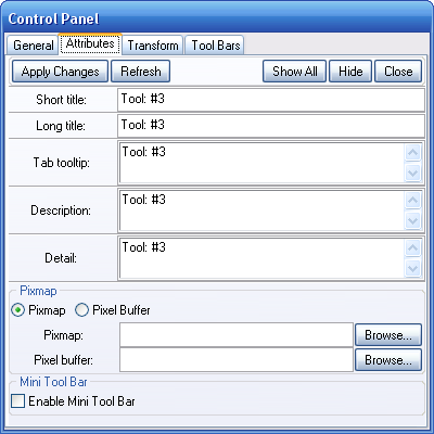
Attribute
- Apply Changes: Set current values to target selected content.
- Refresh: If selected content's attribute changed, press this button to update the values showing in the control panel.
- Show All: Make all the contents visible.
- Hide: Hide current selected content.
- Close: Close current selected content. After close, the content is removed from Smart Docking library. It can't be visible again by pressing `Show All' button.
- Short title: The title which is showing on auto hide tab stub and notebook tab.
- Long title: The title which is showing on the top side title bar of a content.
- Tab tooltip: The tooltip text of content notebook book tab.
- Description: When showing zone navigation dialog (default invoked by `Ctrl + Tab'), we use this description texts for the content.
- Detail: When showing zone navigation dialog, we use this detail texts for the content.
- Pixmap: The icon showing on content notebook tab and auto hide tab if Gdi+ not available on Windows platform.
- Pixel Buffer: The icon showing on content notebook tab and auto hide tab if Gdi+ available on Windows platform.
- Enable Mini Tool Bar: Add/remove mini tool bar to target content. The mini tool bar is showing at the right side of content's title bar.
Transform
- Apply Changes: Apply docking operations to target selected content.
- Type Editor: Set content's type to editor type.
- Type Tool: Set content's type to tool type.
- Type Place Holder: Set content's type to place holder type.
- Position Top: Set content's dock at top level of main window. You can select one of four directions from right side `Directions' options.
- Position Tab With: Set content's tab with another content. You can select another content from right side `Existing Contents', and use the `Direction' options to decide tab at left or right side.
- Position Relative: Set content's dock at one side of another content. You can select another content from right side `Existing Contents', and use the `Direction' options to decide dock at one side of top/bottom/left/right.
- Position Auto Hide: Set content's auto hide which will showing a tab stub at one side of main window. You can select the direction at the right side `Direction' options.
- Position Float: Undock current selected content. You can specify floating position from right side `Screen Position'.
- Default Editor: If current selected content is editor type content, you can set the content to default editor position which is holding by the place holder content.
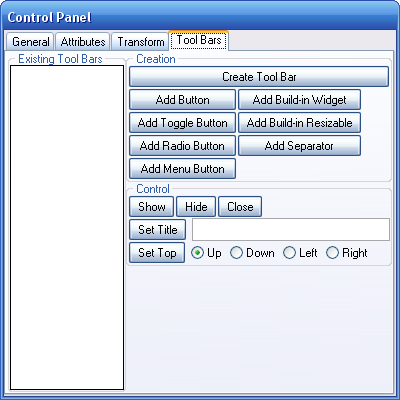
Tool Bar
- Existing ToolBars: Show all existing tool bar in this project. By default, no tool bar available.
- Create Tool Bar: Create a Smart Docking library tool bar and add it at the top side of main window.
- Add Button: Add a tool bar button to selected tool bar in the `Existing ToolBars' list. You should press `Set Top' button to update the target tool bar.
- Add Build-in Widget: Add any Vision2 widgets to the selected tool bar. You should press `Set Top' button to update the target tool bar.
- Add Toggle Button: Add a toggle button to the selected tool bar. You should press `Set Top' button to update the target tool bar.
- Add Build-in Resizable: Add a resizable tool bar button to the selected tool bar. A resizable tool bar item can be resized directly by dragging the end of the item. You should press `Set Top' button to update the target tool bar.
- Add Radio Button: Add a radio button to the selected tool bar. The button is kind of toggle button which selected state is mutually exclusive with respect to other tool bar radio buttons in a tool bar. You should press `Set Top' button to update the target tool bar.
- Add Separator: Add a tool bar separator to the selected tool bar. You should press `Set Top' button to update the target tool bar.
- Add Menu Button: Add a menu item to the selected tool bar. You should press `Set Top' button to update the target tool bar. For the moment (2007 Aug), this kind of item is not fully developed.
- Show: Show the selected tool bar.
- Hide: Hide the selected tool bar.
- Close: Close the selected tool bar. The tool bar will be removed from the Smart Docking library. It can't be visible again by press the `Show' button.
- Set title: Set the title of the selected tool bar.
- Set top: Set the selected tool bar docking at top/bottom/left/right side of main window.

